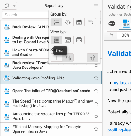
Working further on minor improvements, there is a new view for the document list - the simplified list. It shows the least amount of document detail in the list, but thus allows many more items to be displayed on one screen. It shows a file type icon next to each item and, if there are more than one, there is also a small ‘badge’ with their number. I have also redesigned the menu for managing the list view. To keep it “compact”, I used icons instead of text (the text will only appear in the tooltip when you hover over an icon). The whole feature is shown in the screen below.

