From the beginning the main search field was located at top bar of the application:

You can see here Keepmark logo, repository switch button and search filed (with query wizard button). I think it didn’t look bad. But in practice - this is not very “friendly” location for search field. List of results is presented in other place - when you see the list of documents and want to find one document, probably you will not remember about this search field located outside the context you’re working on.
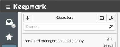
In Keepmark 1.9.0 I’ve decided to move this field to documents list view. It will be located above documents list, and will look like that:

I feel that this is a good decision, especially since I see myself that I started using this search engine more often.
The top bar will look now like this:

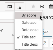
The second one improvement is related with sorting list of documents. I have added new position there “Sort by score”. This kind of sorting give you best matched documents on first positions on the list. This step let you find your documents faster - specially when you have a big repository.

I still have some problems with this area… I’d like to give you best results every time you search. In this case, “score” sorting can be applyed automatically when you start search, but not all use cases of search are about to find best match. In many cases you may only want to filter current view of documents to see only this matched to search phrase, without changing order of presented results.
